Department store retailer House of Fraser has added another element to its multichannel strategy with a new mobile website, which has been optimised for a range of devices.
The mobile site has been developed by Usablenet, also behind the mobile sites of Tesco, M&S and John Lewis.

I've been trying the new mobile site...
Homepage
The product categories are shown in a vertical list, the search box is in a prominent position, as are links to the store locator and shopping basket.
This is a simple layout, and once which makes it as easy as possible for visitors to scan the page and find the links they need.
Navigation
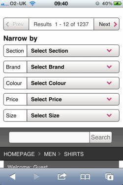
Navigational options are good, with a list of categories on the homepage leading to another page showing the various sub-sections.
Some sub-categories contain large numbers of results (1,237 in the shirts section for example) but there are some good sorting and filtering options which enable shoppers to narrow their selection:
Product pages
Product pages on mobile can be tricky, as they need to show customers enough detail about the product while keeping the page simple to use and quick to load up.
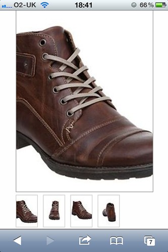
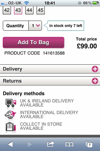
The House of Fraser mobile product pages are a good example of this. The page is well-designed and laid out, with good information and a clear call to action.
The product photos are good, and several different angles are provided for each product:
In addition, all the information that customers require on delivery, returns etc has been provided on the page:
Checkout process
Registration is not compulsory before shoppers enter the checkout, which is a good idea on a mobile site, as it speeds up the process.
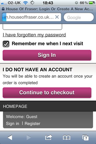
One of the potential barriers to purchase on mobile sites is the hassle of form-filling, and this site has made data entry easy with well-designed forms.
Features such as postcode lookup tools make address entry painless, while if you make a mistake, error messaging is clear, with instructions provided at the top of the page as well as next to the data entry box which requires correction.
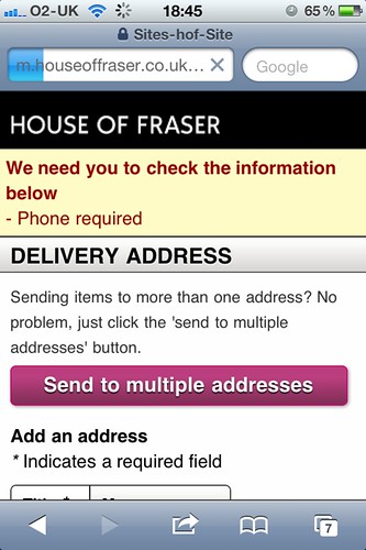
There are a couple of small issues though. If you choose the collect from store option, you need to select your store from a very long drop-down list. This could be made easier by asking customers to enter a postcode or location.
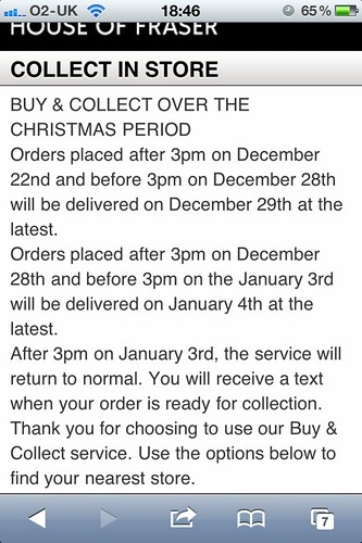
Also, once you have selected 'buy and collect' you still get a message about Christmas delivery. This is irrelevant now, and slows the process down.
Conclusion
The House of Fraser mobile site is an excellent example of mobile commerce usability. It is simple enough to use, quick to load, and easy to navigate.
However, it still provides enough functionality so that customers can find the information they need, see multiple product images, and browse the full range of products from the main House of Fraser site.
"
Heya¡my very first comment on your site. ,I have been reading your blog for a while and thought I would completely pop in and drop a friendly note. . It is great stuff indeed. I also wanted to ask..is there a way to subscribe to your site via email?
ReplyDeleteHouse of Fraser