Monday, November 29, 2010

Tools to Predict and Monitor Competitor Traffic

Tools to Predict and Monitor Competitor Traffic: "

Posted by Sam Crocker

Today we're going to break down a number of different tools and resources for getting insights into competitors traffic data. We have looked at a handful of tools here and will break them down one by one as to their strengths and weaknesses, as well as the validity and usefulness of the data provided. Ultimately we just wanted to share with you some other information sources out there that you can add to SEOmoz's list of tools that are great for competitor analysis (my personal favourites being the Linkscape Visualization and Comparison tool as well as the Competitive Link Research tool).

However, I have had a number of clients asking me for a better view of overall market size and what kind of traffic their competitors are getting. Despite the fact that this has, unfortunately, at times meant crushing a few dreams about who a genuine/realistic competitor is or should be (i.e. NOT mashable if you are a new site) it can be tricky to find meaningful predictive data even when you know who your competitors are.

The Failed Experiment

Initially I wanted this to be an experiment testing out a number of services and running them against Analytics data to compare like for like and find which sites provided the most accurate information. I compiled Analytics data from 25 websites with hopes of comparing the real numbers (from Analytics) against the predictions of the other tools to try to find which was the most reliable across a number of sites from different sectors with a range of monthly traffic from ~1,000 monthly visitors to over 48,000,000 monthly visitors.

The idea was to report on data across a number of these platforms for average monthly visits, total yearly visits, geographical visits and so forth. Unfortunately, there were many fewer tools that provided this data than I initially anticipated and it quickly became clear that we weren't going to be able to compare apples to apples and there is no substitute for internal data... but through the combination of some of the below tools you can get a good idea of what sort of traffic your competitors sites are getting.

So, the experiment was a bit of a failure, but I learned more than my fair share about the tools so let's have a look at which tools are available and which tasks/comparisons they can be used for. I'm hanging on to all the data I collected and at a future date (if I ever hear back from some of the data sources) I will post a follow-up/re-do of the experiment.

The Tool Belt

It is worth pointing out that a number of these sites suggest they can provide better data if you claim the site(s) in question. I cannot testify to the accuracy of this because we have not looked into this (and could not feasibly claim the data for all 25 sites), also, all comments are based upon the free version of the tools as we did not have paid access to any of the tools.

Alexa

Strengths:
Alexa is good for comparing different sites traffic and for monitoring general traffic trends. It can be quite useful for comparing one site to a competitor site (up to 5 sites at a time).
The index is massive and contains some data about all of the 25 sites we tested.

Weaknesses:
Not so great for the smaller sites. As you can see below, you won't get any of the traffic charts for sites ranked outside of the top 100,000 (which means if you Alexa thinks you are getting any fewer than 10,000 visits per month you're unlikely to glean any great information.

Accuracy is a serious concern. This does taint the usefullness of the tool in general.

The numbers reported are not helpful for predicting traffic on their own.

Accuracy:

We want to keep this all anonymous but let's just say one site that we know gets 10-20,000 visits per month had an Alexa rank that was more than 5 times better than a site that we know gets 75,000+ visitors per month. And this was not just a one-off event.

I would have to seriously quetsion the reliability of this tool. It didn't seem to be too bad at predicting the trends for a single site but the charts are extremely difficult to make any real use of. The information on bounce rate seems fairly accurate (give or take a few percent) but the trends for bounce rate seemed much less accurate (e.g. the ups and downs did not seem to correspond with similar peaks and valleys in Analytics).

Perhaps most interestingly it seems to be skewed in favour of sites within the search marketing space. Sites in the search marketing space that we looked at regulary outranked sites receiving more than 10 times as much traffic on a monthly basis.

How to best use Alexa?
The tool is interesting for comparing similar sites or sites within an industry. I would like to recommend the tool but based upon my experience and this particular data set I would have to say I would be very cautious about using this to make any meaningful suggestions or estimates on traffic data. It is a great concept for a site but does not seem to have been particularly accurate.

The most accurate data seemed to be the data from the visitors by country (the order was fairly accurate and the percentages we looked at were not to far off). To the extent that this data would be useful to have for your competitors this would be one good use of Alexa data.

The insights for audience demographics could also potentially be extremely valuable, though accuracy will always be a question.

Cost:
Free. Options for site audits for $199

Compete

Strengths:
Useful interface.
Speak the right language (unique visitors, visits, etc).
Ability to compare multiple sites
Data is easy to understand and well presented.

Weaknesses:
Accuracy
Somewhat limited number of sites - many sites that it classifies as "low sample sites"
Cost of "Pro" option

Accuracy:
Again, accuracy is a serious concern here. The data was off in some cases by as much as 2,000% for monthly visits. The accuracy seemed to be a bit better for the peaks in traffic and some of the general trends we looked at, but was certainly not reliable enough for us to suggest reporting competitor traffic based upon this information.

How to best use Compete?
It should come as no surprise that Compete is best used for comparing competitors. The scale of the data is way off but some of the trends seemed to be fairly reliable. I wouldn't advise reporting any numbers from this data (as they do not seem close/reliable at all - often off by a factor of 2 or more), however the trends are reliable. The information could be meaningfully used to look into seasonal trends between competitors. The demographic information (again, not being able to comment on the accuracy) would also be quite interesting but would require registering your site.

I can't very well recommend the PRO services as I was not able to gain access and was unwilling to pay the cost just for the blog post. I would be extremely interesting in looking further into some of the referral data and the keywords data but this is not available as part of the standard free toolset.

Cost: Free. The PRO membership is $499 per month.

ComScore

Unfortunately we struggled with ComScore. We were unable to get a login or sneak a peak at any of the data. Thus, obviously we cannot comment on the validity of the data, only some of the offerings.

Strengths:
N/A

Weaknesses:
N/A

Accuracy:
N/A

Best use of ComScore:
ComScore offers a number of reports and insights into markets including reports on Local market size, as well as information about valuable/important keywords in an industry. It would be very interesting to find out where this data was coming from and how good it was, but we were not able to achieve this in time to publish this information.

Cost: N/A
Costs were not listed on the site, but rather suggest contacting ComScore directly.

Google Ad Planner

Strengths:
Sites also visited data is good
Keywords searched for can be quite valuable
Audience interests data interesting

Weaknesses:
Accuracy
Lack of data for small sites

Accuracy:
The accuracy was really mixed. For many of the sites AdPlanner provided much better data than some of the others, however, they were still off by miles for some sites - off by as much as 1000%. Again, the data on this in general tended to be better than many of the others, but given the occassional "big miss" I would not be comfortable using this data to make traffic predictions for a client.

How to best use Google Ad Planner:
The data about other sites visited as well as keywords searched for (with affinity) could be extremely valuable. As well as some of the other metrics reported on and audience interests. However, the traffic data is not particularly meangingful and is not to be relied upon.

Pro-tip: The data tends to be better when site owners have granted permission to analytics to publish data, I know we all love open and friendly, but this isn't the sort of thing you neccessarily want to make easier for your competitors to find.

Cost: Free.

Google Insights

Strengths:
Trends around Keyphrases and keyphrase groups
Regional information
Trusted source

Weaknesses:
Difficult to read the data
No hard and fast numbers about traffic
Hard to compare entire sites to one another

Accuracy:
You can bet that the accuracy of this data is going to be pretty good given that the data provider has access to more data than anyone else on the internet. However, the fact that the numbers are normalised and more designed for keyphrases and search terms and trends than for traffic data means that the search volume will correspond perfectly with the traffic to a site.

How to best use Google Insights:
Google Insights could be quite helpful for finding the most valuable pockets of keyphrases and keyphrase groups. This could be particularly valuable when looking at a competitor site and trying to figure out which of their keyphrases are driving the most traffic. Further to that point, it could help you see which of the keyphrases within a keyphrase group might be the most valuable.

Cost: Free.

Google Trends for Websites

Strengths:
Good for illustrating magnitudes of difference between sites
Allows comparison of multiple websites
Includes regional information

Weaknesses:
Not good for comparing sites fairly similar in size
Does not have information for smaller sites when logged in
Accuracy imperfect
No numbers*

Accuracy:
The data seems to be more accurate when only trying to compare traffic from search, it does not seem to do as well in picking the winning recipient of overall traffic. Given that these trends are Google Trends this is reasonable and still paints a fair landscape for an SEO's needs.

When comparing websites with drastically different traffic numbers the rough visual estimation appears to correspond quite well with the observed analytics data as well.

It's a shame there are no actual numbers for the data, but that would just be too easy.

How to best use Google Trends for Websites?
Trends is great for broad information gathering. It gives some insite into similar searches when comparing sites, and in general it is unlikely that you will find better comparative data out there without direct access to your competitor's analytics account. However, Trends does not provide numbers and thus can only be used to venture a guess at what sorts of numbers competitors are pulling in.

When two sites are relatively similar in size Google Trends does not always pick the winner in terms of monthly traffic correctly. For example, one of the sites we tested received around 7.5m monthly visits whilst another received around 8m and Google ranked the 7.5m website higher. However, it is worth noting that the 7.5m visitor site received considerably more volume from search than did the 8m visitor site so from an SEO standpoint this data is probably quite accurate.

Edit 22/11/2010 at 13:47 GMT:

Thank you very much to Jest for pointing out that this information was originally written and summarised when logged out of Google. When visiting the site logged in it does provide data (i.e. numbers/ranges). This information makes the tool considerably more valuable. I must point out that I have not had time to run this across the entire data set, though it is worth pointing out that even with the information the data looks to be off on a few of the sites I have checked. It is not as far off as the data for the same sites using AdPlanner, but still considerably far off (e.g. reporting 140k visits for a site that receives ~320k unique visits daily).

HitWise

Unfortunately we were not able to get data from HitWise in time. The HitWise team was very helpful, responsive and agreeable and we will share this data once we have gotten our hands on it. However, we had not received the data back on the websites in the study in time for publication.

Strengths:
N/A

Weaknesses:
N/A

Accuracy:
N/A

Best use of HitWise:
HitWise, similarly to comScore works on a reporting basis insofar as you speak to them about the types of market reports you would like or you can create custom reports. Whilst we obviously cannot comment on the accuracy of the data the services offered look to be better tailored to an SEOs needs than do the reports offered by comScore. However, generally speaking HitWise will not work with agencies which will be a bit of a bummer for some of you.

Cost: Free-$695+ per report
The range in cost seems to be fairly large. Whether the data warrants the pricing structure cannot really be judged without looking at the data, though they do make some data freely available through their website.

Quantcast

Strengths:
Traffic Numbers that are easy to follow
Design and display of information
Demographic information (when available)
Media Planner Tool

Weaknesses:
Unreliable
Lacks data for small-medium trafficked sites
Accuracy
Inability to compare sites

Accuracy:
Definitely the biggest shortcoming of the Quantcast data is accuracy. As with some of the other sources the traffic data is estimated and is nowhere near accurate on the sites for which Quantcast had any data. Data was off by as much as 10 times the actual analytics data for some of the sites. Again, I cannot say that I would recommend sharing any of the data with a client as an accurate predictor of a competitor's traffic.

Best Use of Quantcast:
Although the data is not particularly reliable for the traffic data some of the other tools the site has to offer seem quite interesting and worth further investigation. The demographics information is also particularly interesting because it provides a reference as to how the data compare against the internet average. This sort of data could be particularly valuable for analysing a market by compiling data across multiple sites.

Cost: Free.

SEMrush

Strengths:
Data Includes sites of all sizes
List of Keyphrases and rankings for thos terms
Most accurate numbered data of all tools looked at

Weaknesses:
Data imperfect
Pay to get full data lists
Data only for Google traffic

Accuracy:
The data was not perfectly accurate, though generally speaking SEMrush did not miss the mark for any of the sites we tested the same way a number of the other tools did. This is, obviously not to say that this data is infallible or that there won't be some issues with some sites, but the data was surprisingly accurate. As with some of the Google data the information reported is just the Google SE traffic, but this is our main area of focus and was quite accurate when drilling down into that specific area of traffic within analytics.

Best Use of SEMrush:
Although imperfect, this tool came the closest to providing accurate data that I would at least with a word of warning, be willing to share with a client about potential expectations or about where there competitors may be traffic wise. Most importantly, the add-on options and ability to see the keyword lists and how the competitor ranks for these terms is extraordinarily appealing to me.

Cost: Free-$499 per month

Conclusion

I hope that the findings from all this research will be valuable to you. At the end of the day it is an incomplete study and I look forward to following up on it when I have another big chunk of time and if/when I get access to comScore, HitWise, Compete PRO and SEMrush Pro. For the time being I would rely most heavily on SEMrush for predicting traffic and estimating how well a competitor is doing, but all of these tools add something to the ever growing toolbelt even if it may be for a purpose other than that which I was hoping they would achieve for me - we all know I love to misuse tools and I'm sure I will come up with some creative ways to use these insights.

Thanks a lot and look forward to any feedback you might have in the comments below or feel free to contact me on Twitter.

Do you like this post? Yes No


"

How Google's New Local SERP Affected Your Ranking

How Google's New Local SERP Affected Your Ranking: "

Posted by number1george

This post was originally in YOUmoz, and was promoted to the main blog because it provides great value and interest to our community. The author's views are entirely his or her own and may not reflect the views of SEOmoz, Inc.

As you probably noticed, last week Google did a pretty big makeover of its local search results page, incorporating the local results directly within the organic results. In some cases it appeared that the old “7-Pack” was just given larger real estate on the SERP. In others, it just looked like the websites were just given links to their Places page. And sometimes, it just looked like an entirely new SERP, different than both the original organic rankings and the lettered, local results. But what was the real effect this change had on local search results?

How I Got My Data

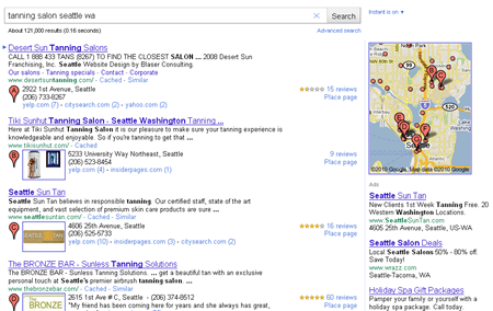
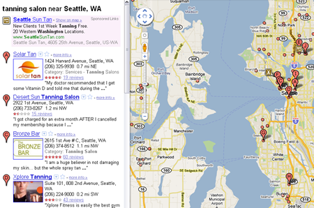
Visually, the new local search results page includes information from the both website and the business's Places page. The title and description are taken from the website but select information from the Places page is also included as well as a direct link to the Places page in Maps. Here we see an example of a search for "tanning salon seattle wa" and how the combined results are displayed.

An example of a new local SERP in Google

To find out the effects of combining the results, I grabbed the rankings of 50 somewhat random websites we’ve been tracking. As an initial criteria, I tried to use sites we’d been tracking for at least 2 months. I also eliminated sites with substantial fluctuations in their rankings within the prior few weeks since there would be no way to attribute those changes to any particular factor. Lastly, though I originally intended to use a completely random sampling, I eventually skipped over several sites that had no change since several of these were in non-competitive areas where they pretty much dominated all other websites for their searches.

After I had my sample, I did some quick research, comparing the organic rankings of several websites prior to the change to their rankings after the change. I then performed the same search in Google Maps in order to determine how their Places pages were ranking individually.

Example of Google Maps SERP

With a few exceptions, the top 7 ranked results in Maps are what were displayed in the old 7-pack for the same search. These listings were ranked independently of the organic results beneath them. By comparing their former organic ranking to their current organic ranking, I was able to see if a change could be correlated to their Places page's ranking in Maps.

So, Was There Any Change?

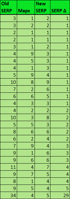
Of the 50 websites examined, 30 of them had an improvement in the new, “combined” results while 6 of them dropped. In most cases, this shift in their ranking could definitely be attributed to the performance of their local listings.

The Good

First, let’s look at the ones that improved. I did eliminate 4 outliers but, for the most part, you can see a direct correlation between the sites’ improved ranking and their local ranking in Maps. Obviously, I can’t publish any actual websites or keyword searches, but the searches all used a typical local query consisting of “business/service city st”.

Local searches with a positive change

Generally, it can be said that sites performing well in both organic and local perform even better in the new consolidated SERP. In several cases you can directly see how a well-performing Google Places listing now pulls up your organic ranking.

In some instances, the combined performance of a business with both a decently ranking website and Places page was enough to push it up a rank or two in the new results. In others, it appears that a well-optimized Places page was able to significantly improve a decently performing website and increase its ranking by several spots. Basically, your local listing’s performance appears to be a significant ranking factor in the new organic results.

The Bad

Since a business’s local listing has the ability to positively affect its website’s performance organic results, let’s look at the ones that dropped in ranking to determine if there is a negative factor associated with the new SERP.

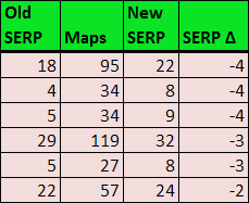
Example of searches with a negative change

First, the fact that the sample size I was able to obtain was so small already implies that a poorly performing business listing doesn’t seem to have much of an effect on a website’s performance. Looking at the original rankings, you can also see that 3 of these sites weren’t doing that great to begin with. In fact, it would probably be fair to assume that their drop was due to an already negative trend. But what about the websites that were doing well but dropped after the update?

Digging deeper into these, I soon discovered that this wasn’t really a direct result of the poorly performing business listings dragging the websites down, but rather that, due to the local results being buried so deep in Maps, Google didn’t associate a business’s Places page with their website. As a result, other websites that did have strong Places pages were ranking higher. So, while having a poorly ranked local listing didn’t penalize the website, it was a whole category of optimization that the website was lacking. Almost like having a great inbound linking strategy but no content structure.

Other Observations

While going through dozens of various local searches, there were a few things that stood out:

  • Directory listings appear to be showing up more frequently in local results, in some cases taking up the top 3 spots in results.
  • The 7-Pack, or rather one-line business listings similar to the old 7-Pack, aren’t gone entirely. Lettered results still tend to show up when Google isn’t entirely sure you’re trying to do a local search. Typically, this happens in searches for smaller cities or regions.
  • When using rank-checking tools, the one-lined, lettered listings won’t be counted - just like before. The larger results being discussed here, however, are treated just as normal organic results prior to the change, completely disregarding the letter and local information assigned to it.
  • Lastly, while I encountered plenty of websites on the first page without a Places page, I encountered very few Places page ranking on the first page without a website. Prior to the change, it was not uncommon to regularly see local listings with no associated website ranking in the 7-pack. Now it appears that, without a website, it is nearly impossible to be in the first page of Google’s general SERP for most searches.

What Does This Mean?

So what can we learn from all this? Basically, it’s just what Google said all along - everything is important. Your best bet is to have both a terrifically optimized website and an optimized, claimed Places page to associate with it.

Not only does Google seem to use a Places page as an organic ranking factor, but having one also gives you nearly twice the real estate devoted to your business in the results. Instead of just having a few words in your title tag and meta description to sell your business, you now have your address, phone number, reviews, lists of other websites that mention you, and even a picture to draw attention to your website.

Bottom line: all those old debates about whether it was better to have the top-ranking website in organic or have your business at the top of the 7-pack are over. Even if this isn’t the final layout, it’s clear that Google intends to make both count.


Do you like this post? Yes No


"

Showcase Of Beautiful But Unusable Websites


“Form follows function” is a widely accepted — albeit controversial — principle that most designers in a variety of disciplines have adopted since its inception at the turn of the 20th century. On the web, we commonly refer to function as usability which is the ease of use and navigation of a website in order to achieve user’s goals.
In this showcase we present websites that sacrifice usability for beauty and present issues related to clutter, loading, navigation, archiving or visibility. Unfortunately, although the sites featured in this showcase are visually appealing, they are quite difficult to use. By studying such examples, we can learn what mistakes we can avoid in our designs and how not to strive for strong aesthetic appearances on the account of usability.
You may be interested in the showcase of Bizarre Websites On Which You Can Kill Time With Style as well.

Visual Clutter

Where do I look? Where do I click? What do I do? Visual clutter is one of the most serious issues a designer can present to an audience. Not only is the user unlikely to achieve the desired goals (because it’s hidden in the clutter), chances are they’ll just leave out of frustration before they do anything.
Creative With aK
Navigation overload! Not only are we unsure of where to look, we’re unsure of what’s clickable! Having to scan around the design with the mouse is not helpful for usability. And that’s if, and only if, you get past the load screen with no load progress bar. In addition to that, it takes a while until one has figured out that the welcome screen has to be closed to enable the actual in-site navigation. The inexistant scroll finally lets potentially interesting content disappear under the frame of the browser window.
Creativewithak in Showcase Of Beautiful But Unusable Websites
Marc Ecko
Marc Ecko is an extremely successful businessman with countless ventures and he definitely wants us to know it. The problem is, he’s got so much business we don’t know where to start, provided you get used to the almost erratic horizontal scrolling feature! Getting the information you are looking for will take quite some time.
Markecko in Showcase Of Beautiful But Unusable Websites
Content Of
Even after reading the “About” page and randomly clicking links, we’re still not sure what this page actually is about. Our best guess is a portfolio, but due to link clutter and no solid explanation of what the navigation does, we’re left confused.
Content-of in Showcase Of Beautiful But Unusable Websites
There Studio
Half of the circles that look clickable aren’t; the other half jumble into a new rotation if you drag and drop them. Granted, the movement makes sense for the philosophy of the company, and there isn’t too much clutter, but it took us a minute to figure it all out and that’s 58 seconds too long. If you feel the need for more bubbles, click and drag on the empty space to add more to the confusion.
There-studio in Showcase Of Beautiful But Unusable Websites

Loading Issues

As bounce rates increase, and time-on-sites decreases web-wide, it is becoming increasingly important to grab people’s attention immediately. By the time all of your effects load, chances are your user is back on Google or Facebook looking for the next cool site. Loading times, skip buttons, missing instructions on navigation and many other issues are all subject of considerations here.
Coke Light
One of the worst things you can do as a Flash designer is force an introduction on your audience. A long intro and no skip button means this site is likely to be abandoned by most of its visitors before they get in. Add an unclear “Call to Action” and no visual navigation indicators and most people will never encounter the beauty this site has to offer. Long transitions back to the home screen waste time the visitior could have spent successfully “travelling the world”, searching for the numerous balloons hidden within the map.
Gringo in Showcase Of Beautiful But Unusable Websites
Design Sul
We’ve never seen so many load issues on one site. Multiple load times for different elements, re-loads once you’re in to the site core, and no clear indication that loading is finished make for an extremely confusing and difficult to use website. Actually, discovering how to reach the content takes some time, what it all has to do with milk cartons is a different question.
Designsul in Showcase Of Beautiful But Unusable Websites
Nicola Walbeck
A big loading wait-time at the beginning of the site is excruciating, but sometimes manageable once you enter a beautiful, usable website. Scratch that here, because once you get in, you’ll have to wait again and again for each individual image, forcing you to stare at blurred photographs. A better idea would be to use loading bars on the image to indicate that the image is loading. If you are on a broadband connection, then it’s fine, but if you are not, you start to get nervous very quickly. Add the fact that there’s no prominent back button and the experience could be a bit frustrating.
Nicolawalbeck in Showcase Of Beautiful But Unusable Websites

Navigation Issues

For content/category heavy sites especially, navigation is extremely important. Imagine driving without a map, or the grocery store with no aisle indicators. Navigation tells us where to go and how, or — in these cases — tells us very little. You might consider taking a compass with you, these examples make getting lost easy.
EContent
After quite a long load, this site requires the user to click “enter”. Okay, we’re in. Unfortunately, although there is a quick-menu, it does not draw attention and the user is required to blindly scroll over images to see categories. Navigate with caution and carefully look out for navigation buttons!
Econtent in Showcase Of Beautiful But Unusable Websites
Prism Girl
Unusable sites have actually developed conventions. When we don’t see clear category navigation on a beautiful site, we poke around with our mouse looking for the category links. This site is beautiful (and complex) enough to poke around for an hour, but you’ll probably never guess you have to click on the mouse trailing icon to enter. Other than impressive design work, this site does not have much to offer.
Prismgirl in Showcase Of Beautiful But Unusable Websites
On Toyota’s Mind
Slow load time leads to an unclear ‘Call to Action’, no visually clear navigation as well as a hard-to-find back action. Our question: What crossed Toyota’s mind when conceptualising this site?
Northkingdom in Showcase Of Beautiful But Unusable Websites
Theologos
No button to skip intro. No visually clear navigation. Slow transitions. And here’s the kicker, a separate page to mute the music player. When visiting the site using a fast connection, the animations make the visit even less enjoyable.
Theologos in Showcase Of Beautiful But Unusable Websites

Archiving/Category Issues

Your site loaded fine, it’s clear what you want people to do, you have a solid navigation, but once the user begins moving around, they can’t figure out your category structure. When you want meat, you go to the deli, not the dairy aisle. Some sites, unfortunately, get it wrong.
Self Titled
A hidden quick menu and unclear category organization make this site difficult to navigate. The actual information one gets when entering a category is rather scarce.
Selftitled in Showcase Of Beautiful But Unusable Websites
Vanalen
Image slivers make-up the category composition on this site, giving us very little information as to where/what to click on. If you’re new to the site, you are likely to spend a while until you find what you were looking for.
Vanalen in Showcase Of Beautiful But Unusable Websites
Grip Limited
The website does tell you to “click and drag” but finding this instruction amidst what looks like a typographic poster is something we suspect many people weren’t able to do. Realizing this might be a problem, Grip did create an “Open Menu” bar at the top of the page, but what are the chances you’re going to look there?
Grip-limited in Showcase Of Beautiful But Unusable Websites
Kyle Tezak
Another example of an extremely talented visual artist who has great design work, but a small usability problem makes the user experience less enjoyable. There is no actual navigation on this page, just a floating header and illustrations of Kyle’s work. To find the designer’s contact information, you need to click on the “Information” link in the upper right corner. Using more traditional wording would improve usability: e.g. putting an e-mail right there or naming it “Contact information” or adding contact information at the bottom of the page would help. A nice example of how one little detail can improve site’s usability.
Tezak in Showcase Of Beautiful But Unusable Websites

Visibility/Scrolling Issues

A site may be uncluttered and have great navigation, but if the magnification is off, or scrolling is dysfunctional, no one is going to see it. Visibility issues can quickly turn to invisibility issues as users navigate away from your site.
Real Casual
This site is invisible until you start hunting with your mouse, at which point different areas of the screen appear. A long roll-over hunt is followed by long load times, during which fade effects additionally take your chance to get a good look at content.
Realcasual in Showcase Of Beautiful But Unusable Websites
Lego Click
Scrolling is conventionally top to bottom or left to right, but this site starts at the bottom which is confusing. Add to that an inability to retrieve closed elements, and several other minor issues, and you get an extremely frustrating (but beautiful) website from Lego.
Legoclick in Showcase Of Beautiful But Unusable Websites
Journey to Zero
This site is rather large, but you wouldn’t know it. It starts magnified with no suggestion to drag scroll, leaving the user wondering where all the content is. If you scroll too far on the other hand, you might end up in empty regions of the site, making it hard to get back to the content. Very beautiful website that is difficult to use.
Journeytozero in Showcase Of Beautiful But Unusable Websites
Faub (currently offline)
Another beautiful site that starts magnified and does not let you decrease the magnification, or suggest dragging for navigation.
Faub in Showcase Of Beautiful But Unusable Websites
Uniqlo
Uniqlo presents what looks like a beautiful and usable online store. That is, until you’ve added 10 items to your cart only to find out there is no check-out. Turns out it’s not a store at all, just a wishlist! A truely frustrating experience for every consumer willing to spend!
Uniqlo in Showcase Of Beautiful But Unusable Websites
Bio Bak
Another drag navigation site that’s just too big for its own good. This is one of our favorite sites from a beauty/having fun perspective, but it does an awful job of presenting the design agency from a usability perspective. Using the mouse wheel by chance let us discover that the site has more to offer than what is visible on the first glace.
Biobak in Showcase Of Beautiful But Unusable Websites

Summary

Design for function and communication. If your website ends up beautiful in the process, you kill two birds. Design for beauty only if the primary function of your site is to convey beauty.
Be wary of visual clutter, especially in navigation and on landing pages. Designing with too much clutter can make an audience unsure of how to use your site. In the worst case users won’t be able to load your page in the first place. Web customers don’t like to wait. Ensure that your site has a fast, clear load that conveys an easy understanding of how long it will take and when it is finished. This minimizes your risk of losing visitors to other sites in the meanwhile, keeping them occupied with joyous anticipation.
Once users arrive, you want to direct them to certain pages on your site. Always make clear what and where your navigation is, and what each element of your navigation does. Don’t make users guess or poke around to find an answer. On big sites, with lots of content, archiving and categorization is especially important. Make sure people can effectively navigate your archives. Try to make your menus self-explanatory, saving the users time, letting them invest it in effective exploration of your site.
Visibility is a huge issue most people don’t consider. In addition to designing for minimum resolutions, make sure your audience can clearly see the content you want them to at all times. If you’re designing to sell, make sure you’re designing to sell. This is especially important as your goal is to promote purchases. The more difficult you make it to buy your product, the less likely you’ll make money.

Sunday, November 21, 2010

What’s Making Your Site Go Slow? Could Be The Like Button

What’s Making Your Site Go Slow? Could Be The Like Button: "

Based on a number of reports, it has become pretty clear that the Like buttons and other Facebook social plugins have been slowing down many of the sites that use their product.


For months now it has been a well known fact among the developer community that Facebook’s plugins can frequently run into loading problems. While Facebook is well aware of the issue, and most definitely working on resolving it, that doesn’t stop the fact that the page load can be extremely slow. One large publisher, who wanted to remain unnamed, sent us the chart below which highlights the peak loading time for the like button sometimes.


Like Load Time Screenshot


While most sites aim to have their site completely loaded within a fraction of a second, it appears as though the load time can drag on dramatically, and in the case of the publisher that reached out to us, Facebook can drive the sites to take up to 6 seconds to load. Ultimately, any external widgets you use can slow down a site, however it’s well known that Facebook can be one of the primary forces behind that. Now we have some numbers to show that’s the case.


Have you had the like button slow down your site at all?

Friday, November 19, 2010

Tips on How to Code Web Designs Better

Tips on How to Code Web Designs Better: "

Tips on How to Code Web Designs Better


Writing semantic, efficient and valid HTML and CSS can be a time-intensive process that only gets better with experience. While it is important to take the time to produce high-quality code — as it is what separates professionals from hobbyists — it is equally important to produce websites as expeditiously and efficiently as possible.


As web designers, we’re always looking for ways to be more productive. Getting more work done in less time while at the same time maintaining (or improving) our products’ quality is a lifelong quest for many of us.


This article discusses a few fundamental techniques for writing high quality and efficient HTML and CSS.


Use Templates and Frameworks (Even If It’s Homemade)


Using templates and frameworks provides you with a solid baseline from which to start from. For example, CSS frameworks such as the 960 Grid System and Blueprint can save you time in having to write code for bulletproof web page layouts. The purpose of a framework is to reduce development time by avoiding having to repeatedly write cross-browser-tested code for each of your projects. However, take note: Using frameworks involves a learning curve and can bulk up your web page sizes with unnecessary style rules and markup.


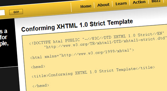
Even something as simple as using this XHTML 1.0 strict template — a skeleton for your HTML documents — can be a time-saver.


XHTML 1.0 strict template


Whether you choose to use a premade framework or not, the notion you should take a note of is just how much code you end up writing over and over again. It’s imperative to discover these repetitive tasks so that you can come up with a system (a custom template/framework) to help you speed up your workflow.


Conform to XHTML 1.0 Strict Doctype


Writing under the Strict doctype forces you to produce smarter and specifications-conformant code. Strict doctype lowers your desire to use hacks, deprecated elements, proprietary code, and unconventional markup that in the future will give you grief and maintenance costs related to debugging and updating projects.


Conform to XHTML 1.0 Strict Doctype


Strict doctype also instructs web browsers to render your web pages under strict W3C specifications, which can reduce browser-specific bugs and thus lowering your development time.


Use Good and Consistent Naming Conventions


Always use consistent naming conventions for easier organization and so that you can produce work that is meaningful and expressive.


For example, if you use hyphens (-) to separate words in your classes and IDs (e.g. sidebar-blurb, about-us), don’t use underscores (_) for others (e.g. footer_nav, header_logo). Also, using standard and meaningful filenames for documents and directories is a good practice to get into.


Here are some popular classes, IDs and file names:


  • Structural IDs: #header, #footer, #sidebar, #content, #wrapper, #container

  • Main stylesheet: style.css, styles.css, global.css

  • Main JavaScript library: javascript.js, scripts.js

  • JavaScript directory: js, javascript or scripts

  • Image directory: images, img

  • CSS directory: css, stylesheets, styles


Naming Conventions


Always use meaningful words for your IDs and classes. For example, using left-col and right-col for div ID attribute values isn’t good because they rely on positional factors rather than semantics. Using something that has greater semantic value such as main-content or aside would be better so that you are giving your layout elements improved meaning and greater flexibility towards changes in the future.


In HTML5, the issue of proper naming conventions and uniformity for layout elements has been addressed with the introduction of new HTML elements such as <nav>, <footer> and <article>, but the concept of using proper naming conventions applies to all HTML elements with ID/class attributes, not just layout elements.


Read more about naming conventions in this article called Structural Naming Convention in CSS.


Good naming conventions are just a best practice in general, but as a bonus, it can help you speed up your development process because of organized and intuitive code, which makes finding and editing things quicker.


Understand and Take Advantage of CSS Inheritance


Instead of assigning every single element a font, color, background, etc., try to take advantage of CSS inheritance rules, especially for fonts, padding and margins. This can reduce the amount of code you have to write and maintain.


For example, the following is terser:


html, body {
background: #eee;
font: normal 11pt/14pt Arial, Helvetica, sans-serif;
color: #000;
}
ul, ol {
font-size: 18pt;
}

Compared to:


html, body {
background: #eee;
}
p {
font: normal 11pt/14pt Arial, Helvetica, sans-serif;
color: #000;
}
ul, ol {
font: normal 11pt/18pt Arial, Helvetica, sans-serif;
color: #000;
}
blockquote {
font: normal 11pt/14pt Arial, Helvetica, sans-serif;
color: #000;
}

Reset Your Style Rules


One of the biggest time-sinks in web design is debugging browser-specific bugs. In order to ensure that you start off with a solid baseline — and thus avoid differences across web browsers — consider resetting your CSS. Read more about this subject in the article called Resetting Your Styles with CSS Reset.


Just like using CSS frameworks and HTML starter templates, there are several CSS reset templates that you can take advantage of. Here is a couple:


Here is Eric Meyer’s Reset CSS:


/* v1.0 | 20080212 */

html, body, div, span, applet, object, iframe,
h1, h2, h3, h4, h5, h6, p, blockquote, pre,
a, abbr, acronym, address, big, cite, code,
del, dfn, em, font, img, ins, kbd, q, s, samp,
small, strike, strong, sub, sup, tt, var,
b, u, i, center,
dl, dt, dd, ol, ul, li,
fieldset, form, label, legend,
table, caption, tbody, tfoot, thead, tr, th, td {
margin: 0;
padding: 0;
border: 0;
outline: 0;
font-size: 100%;
vertical-align: baseline;
background: transparent;
}
body {
line-height: 1;
}
ol, ul {
list-style: none;
}
blockquote, q {
quotes: none;
}
blockquote:before, blockquote:after,
q:before, q:after {
content: '';
content: none;
}

/* remember to define focus styles! */
:focus {
outline: 0;
}

/* remember to highlight inserts somehow! */
ins {
text-decoration: none;
}
del {
text-decoration: line-through;
}

/* tables still need 'cellspacing='0'' in the markup */
table {
border-collapse: collapse;
border-spacing: 0;
}

The best practice for using CSS reset templates is to fill in the property values of "resetted" styles instead of re-declaring them again.


For example, in Eric Meyer’s Reset CSS shown above, the line-height of web pages on the site is set to 1. If you know that your line-height needs to be 1.5, then you should change 1 to 1.5.


Do not do this when using CSS reset templates:


/ * Not good */
body {
line-height: 1;
}
...
body { line-height: 1.5; }

In addition, it’s best to avoid resetting CSS properties using the universal selector (e.g. * { margin: 0; padding: 0; }) because, performance-wise, it is inefficient and can be resource-taxing on older computers. Read more about using efficient CSS selectors.


Use CSS Shorthand Properties


Writing less CSS means saving time. Not only does using shorthand CSS reduce code-writing, but it also lowers the file sizes of your stylesheets, which ultimately means faster page response times. Additionally, shorthand CSS makes your code cleaner and — albeit arguably depending on your preference — easier to read and maintain.


The following are some popular shorthand syntax to memorize and use, with the longhand syntax equivalent preceding it.


Margin and Padding Properties


/* Longhand */
margin-top: 0;
margin-right: 20px;
margin-bottom: 10px;
margin-left: 15px;
padding-top: 0px;
padding-right: 20px;
padding-bottom: 0px;
padding-left: 20px;

/* Shorthand */
margin: 0 20px 10px 15px;
padding: 15px 20px 0;

A quick guide:


  • When 4 property values are used – margin/padding: [top | right | bottom | left]

  • When 3 property values are used – margin/padding: [top | left and right | bottom]

  • When 2 property values are used – margin/padding: [top and bottom | left and right]

  • When 1 property value is used – margin/padding: [top, right, bottom, and left ]


Font Properties


/* Longhand */
font-style: normal;
line-height: 11px;
font-size: 18px;
font-family: Arial, Helvetica, sans-serif;

/* Shorthand */
font: normal 18px/11px Arial, Helvetica, sans-serif;

A quick guide:


  • font: [font-style | font-size/line-height | font-family];


Background Properties


/* Longhand */
background-color: #ffffff;
background-image: url('../images/background.jpg');
background-repeat: repeat-x;
background-position: top center;

/* Shorthand */
background: #fff url('../images/background.jpg') repeat-x top center;

A quick guide:


  • background: [background-color | background-image:url() | background-repeat | background-position];


To discover more shorthand CSS syntax, take a look at the CSS Shorthand Guide.


Put Things in the Proper Place and Order


Always put things in the conventional place, i.e., where best practices and W3C specifications say they should go. For example, it is best practice to reference external JavaScript libraries after external stylesheet references to improve page responsiveness and to take advantage of the nature of parallel downloading.


This is the best way:


<head>
<!-- CSS on top, JavaScript after -->
<link rel="stylesheet" type="text/css" href="styles.css" />
<script type="text/javascript" src="script.js" />
</head>

The suboptimal way:


<head>
<!-- CSS at the bottom, JavaScript on top -->
<script type="text/javascript" src="script.js" />
<link rel="stylesheet" type="text/css" href="styles.css" />
</head>

Note that both code blocks above are valid under specs, but one is better than the other.


When writing structural markup, think in terms of top to bottom and left to right because that’s the accepted convention. If a sidebar is to the right of a content area and below a header, then the markup should be organized as follows:


<div id="header">
</div>
<div id="content">
</div>
<div id="sidebar">
</div>

However, if the sidebar is on the left, a better practice would be to organize markup like this:


<div id="header">
</div>
<div id="sidebar">
</div>
<div id="content">
</div>

A caveat to the above is when you are optimizing your work for screen readers. The second code block above means that screen readers will always encounter the secondary content (#sidebar) before the main content (#content), which can hamper the reading of people that require screen-reading assistive technologies. In this case, you could place #sidebar lower down the document and use CSS for visual positioning (i.e. float #sidebar to the left, float #content to the right).


In addition to putting HTML elements in their respective places, it’s also important to organize CSS (again, for easier maintenance and readability). In a way, it should mimic the organization of your markup. For example, the #header styles should be before the #footer styles. This is a matter of preference, but it is also a conventional way of organizing style rules.


/* Structural Styles */
#header {
// header properties
}
#header .logo {
//site's logo properties
}
#footer {
// footer properties
}

Conclusion


As in most things, the way to better and more efficient coding is to work smarter, not harder. The tips discussed in this article are basic; however, it might also inspire you to delve deeper into these sorts of optimizations and enhancements for improving the craftsmanship of the things you make.


What are your own tips and techniques for better and more efficient coding?


Related Content


About the Author


Kayla Knight is a web designer and web developer who loves coding way too much for her own good. She does freelance design/development work and helps run the XHTML Shop. Connect with her by visiting her website and following her on Twitter @ KaylaMaeKnight.


"

Facebook’s Efforts in Japan, South Korea and Russia Show New Localization Focus

Facebook’s Efforts in Japan, South Korea and Russia Show New Localization Focus: "

For most of its history, Facebook has tried to build a single product that works for everyone in the world. The only localization it offered was the text on the site, and even that was a one-size-fits-all product — its Translation tool allowed it to quickly launch in new languages using feedback from users.


But now, we’re seeing more signs of Facebook trying to customize its products for specific locations, at least for a few major markets where it wants to grow. Some of the latest examples are a new game-style Facebook site tour for new Japanese users, and a small engineering expansion in South Korea. We’ll look at these and more, below.


Certain Countries Get Special Attention


The stage has already been set for product localization. Company chief executive Mark Zuckerberg said in October that four countries had become targets for new growth over the past year: South Korea, Japan, China and Russia. Aside from all being located at least partly in Asia, these four companies are also notable because they all have well-established local social networking competitors: Vkontakte in Russia, Cyworld in Korea, Mixi in Japan and Tencent among others in China. More generally, all of these countries have unique languages, cultures, and in some cases government regulations that have historically hindered outside competitors.


Out of those four, Facebook is blocked in China — the company has hinted that it might work with the government in order to be allowed in, but that hasn’t happened yet. So here’s a look at what’s happening with Facebook in the other three locations. All data is from our Global Monitor report, part of our Inside Facebook Gold subscription service. Note for subscribers: We’ll be coming out with a detailed new monthly report analyzing worldwide Facebook traffic and trends, with the first one arriving in early December.


Japan


Facebook’s first foreign engineering office opened in Tokyo, Japan, this past year. So far, it has introduced products like a customized interface for mobile users, and an in-house app designed to help users with job searches. That app, the first Facebook has made for a local market, is most interesting for its cultural focus — it is intended as a way for users to make connections in the traditionally rigid Japanese job market.


It also introduced a way to syndicate Facebook content to Mixi accounts.


The most recent example of Japanese localization is from a couple weeks ago, when Facebook added a new site tour that prompts users to take a set of four “missions.” The missions are just a series of screenshots and text explaining how people can fill out their profiles, and include tips aimed at Japanese users (like talking about the value of using real-world names). This sort of site tour page doesn’t currently exist in other languages that we know of, which is reflected in the Japanese page’s generic Facebook URL.


Japan’s growth began picking up around the middle of 2009, after the first translated version of the site became available. Since then, it has lagged much of the rest of Asia in the world. But it’s continued to steadily climb, and had its highest numbers yet in October, with 1.69 million monthly active users and 262,000 new ones.


South Korea


Facebook isn’t saying much about what it’s doing in the country. The two previous postings about contract sales engineering positions are no longer on the Careers page, but there’s a new posting for a full-time sales engineering position. Besides the job listings, the most prominent thing the company has done was launch a dedicated page about the country.


We’ve heard it could be expanding its local engineering operations beyond sales, but a spokesperson’s response seems to shoot that down. “We are currently only hiring for jobs that are posted on the Careers page, and don’t have much more to say on rumors and speculation.” The expansion, in whatever form it might be taking, has not yet resulted in any Korea-focused Facebook products.


Yet, after a first year or so of slow growth, the country’s Facebook base has quadrupled since April, passing Japan to reach 267,000 new users and 1.73 million total MAU by October. Facebook, as Zuckerberg suggested, has even bigger ambitions.


Russia


The last difficult-but-winnable country on the list is Russia, where the social network faces a number of homegrown rivals. Facebook shares an investor, Digital Sky Technologies, with a few of these including Vkontakte. So far, the company has done a couple 0.facebook.com mobile integration deals so mobile users with some local carriers can get free access to the site, for example. But the ’0′ deals aren’t particularly special, since the company has done dozens of those deals around the world.


Facebook started making Russia-specific moves a few weeks ago, when leading Russian search engine company Yandex began tightly integrating Facebook content in a special deal similar to what Facebook is doing with Microsoft’s Bing search engine (but not with Google).


Russia, like the previous two countries, is seeing a distinct growth surge. It grew by 548,000 last month to reach 2.132 million MAU — a striking increase given its slower history, and local competition.


What the Future Holds


These examples are new and mostly basic, but we expect the localization efforts to increase as Facebook looks to strengthen its market position around the world. Beyond more guides and other content, it will likely try to use its products to benefit key local partners , as with the case with Yandex, or to help solve relevant market problems, as is the case with the Japan job search app.


Stay tuned for more detailed coverage of Facebook around the world in our Inside Facebook Gold data and analysis service.


"

Disqus for ully's online marketing

Disqus for ully's online marketing